
Monthly Learning
Solar Electricity Technology
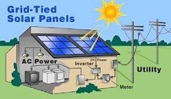
Solar cells or Photovoltaics (PV) convert sunlight into electricity. Learn about modules, arrays and applications.

About SHEIR
World's leading provider of scientific and industrial recognition, connecting professionals with business.